Divi Hacks Plugin
Examples & DocumentationShortcodes in Menus & Divi Mega Menus
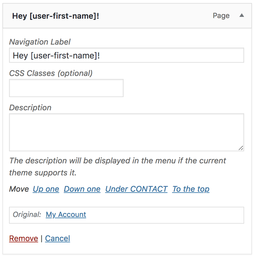
Shortcodes are enabled in Menu items. This can be useful to display dynamic content such as the logged in user’s name or using the ‘Modules in Modules’ hack to display custom dropdowns (also known as mega menus).
To add a shortcode to a menu item, simply add the shortcode into the Navigation Label box.
You can also add it to a Custom Link and use # as the URL if you don’t want the page to link anywhere.
In the example, we are using the User Meta Shortcodes to display the logged-in user’s first name.
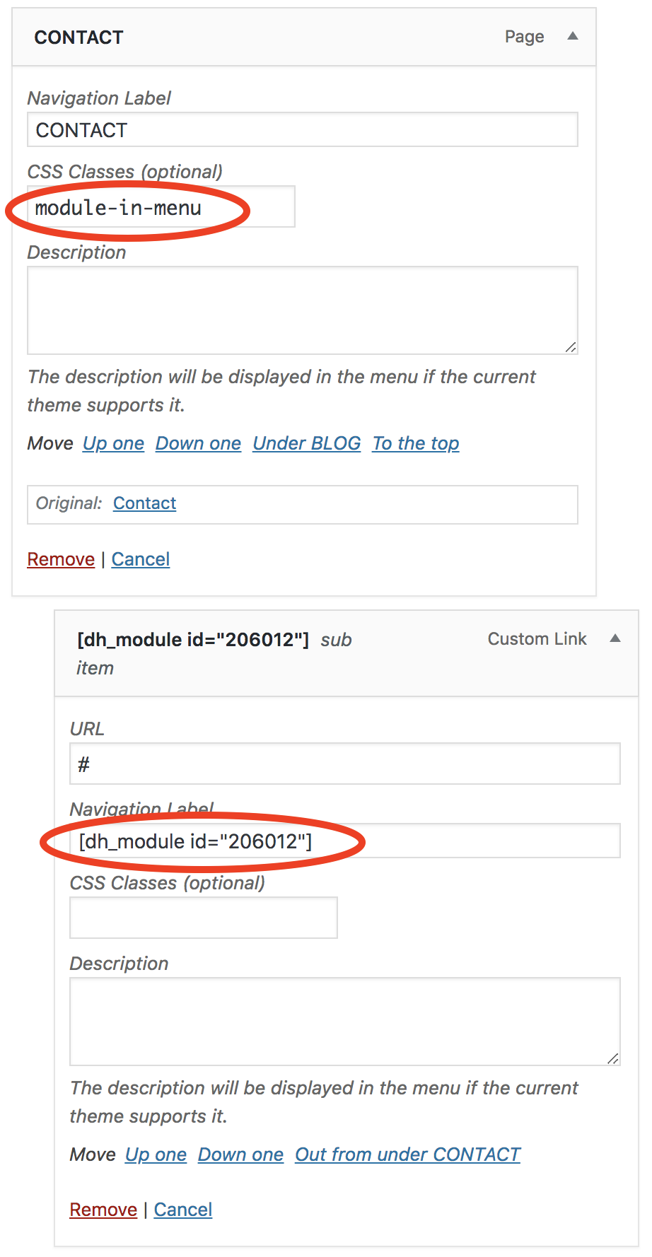
Custom Dropdown Mega Menus
With the “Shortcodes in Menus” Divi Hack you can create gorgeous mega menus using Divi builder content.
If you want more mega menu features, take a look at our Divi Mega Menu plugin.
Follow these directions to add any section, row, or module to a menu item dropdown.
- Add the class module-in-menu to the top navigation menu item (the item you want the dropdown to appear under).
- Create your custom section, row, or module and save it to the Divi Library as a global module.
- Then, use the modules in modules hack to grab the shortcode of the item you just saved to the library.
- Add the shortcode to the Navigation Label box in the dropdown menu item.
- Next to module-in-menu, add any of the following classes to the top menu item, to set the width of the dropdown. Each class is based off the browser window width.
- width-full = 100% of browser width
- width-1-2 = 1 half of browser width
- width-1-3 = 1/3rd browser width
- width-1-4 = 1/4th browser width
- width-1-5 = 1/5th browser width
6. Align the dropdown to the left or right side of the top menu item. Default is right.
- right
- left
(Optional) Stack all columns on top of each other.
**Only works on width-1-5 & width-1-4**
- stack
**Note: Modules in menus only show on desktop devices. Because of this, make sure the top menu item actually goes somewhere (since the dropdown will be hidden). Alternatively, you can hide the entire top menu item on mobile devices using CSS:
- .is-mobile .module-in-menu { display:none; }