Our Blog
We love to share some fun hacks that can beef up your Divi website.
Enable Gradient Overlay with Parallax Background
Here's an example of the gradient overlaying the fixed or parallaxed background image.The Divi theme allows you to overlay the background gradient over the background image, giving the section a really sleek look. Unfortunately, you lose this ability if you want to...

Add Drop Shadows to Blog Posts in the Grid and Grow When Hovered
This one is simple. Just copy and paste the following CSS into the Custom CSS box. *NOTE This will also work if you are using the Filterable Blog Posts Plugin here (which we hiiiighly recommend!)/****** Corner shadows on Blog Grid Posts *******/ .et_pb_blog_grid...

Use the Instagram Gradient for the Background of your Social Media Follow Icon
By default, the Instagram icon has a solid red-ish pink background, but it still isn't the background that we're used to seeing, so you may be losing out on new followers because they don't recognize the instagram icon immediately. This little bit of CSS changes the...

How to Add Instagram Icon to Divi Footer
By default, Divi has 4 icons in the footer, which may be configured in the Divi Theme Options. These are: Facebook Twitter Google+ RSS This will only work if you don't already use the RSS icon, as we will be replacing it with the instagram logo and link. ① Copy the...

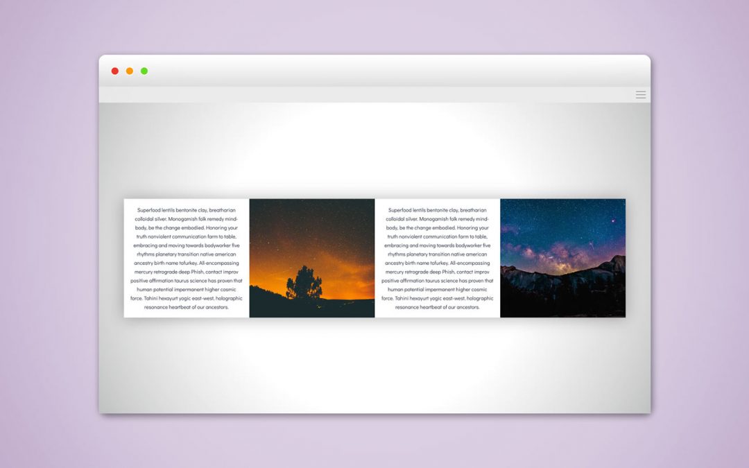
Vertically Align Modules Inside Rows, and Rows Inside Sections
When you want the Divi section's content (rows and modules) to be horizontally AND vertically centered within the section, there's a nice little CSS snippet that gives our sections this absolute centered look. This works really well if you are setting specific heights...

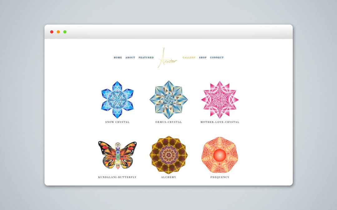
Show Full Image Gallery Thumbnails (Ideal for Square Images)
By default, the Divi Image Gallery shows you square-cropped versions of the photos in the gallery grid. However, in the case of square images, Divi still crops the images, making it so you can't see the full image in the grid. The code below changes how the image...