Divi Hacks Plugin
Examples & DocumentationBlog Grid Corner Shadows
This is a simple hack that adds a zoom or grow animation to blog posts in the grid layout. It also gives the posts corner shadows.
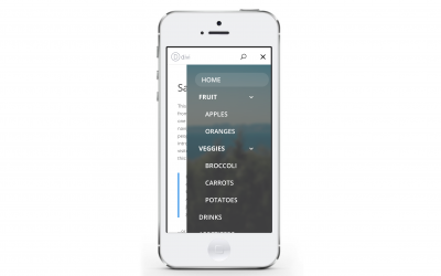
Customizing Your Divi Mobile Menu
Personally, I think the default mobile menu on Divi is super boring. Every new Divi website I create always gets one of these custom menus. *Credit goes to Fabio Sarcona of creativechildthemes.com for these. Unfortunately the original blog post is no longer available...
Animate Multiple Background Images – CSS & Javascript Version
This post is an extension of the CSS-only way to do this. Unfortunately, the CSS method (as you'll see) causes a white flicker between the images, the very first time they are loaded into the div. This CSS & Javascript version fixes that white flash. This tiny bit of...
Animate Multiple Background Images – CSS Only Version
You may want to know how to animate or fade between different background images in a Divi section. This tiny bit of CSS gives you a really nice looking background fade/slider. *Update* Unfortunately, this CSS-only version causes a white flicker between photos the...
Blur the Parallax Background to Emphasize the Text
When the Parallax option is enabled, Divi puts the image in it's own div. This allows us to customize it further. By blurring the background image, it helps the user put focus on the elements within the section. ① Copy and paste the following CSS into the Custom...
Enable Gradient Overlay with Parallax Background
Here's an example of the gradient overlaying the fixed or parallaxed background image.The Divi theme allows you to overlay the background gradient over the background image, giving the section a really sleek look. Unfortunately, you lose this ability if you want to...
Add Drop Shadows to Blog Posts in the Grid and Grow When Hovered
This one is simple. Just copy and paste the following CSS into the Custom CSS box. *NOTE This will also work if you are using the Filterable Blog Posts Plugin here (which we hiiiighly recommend!)/****** Corner shadows on Blog Grid Posts *******/ .et_pb_blog_grid...
Use the Instagram Gradient for the Background of your Social Media Follow Icon
By default, the Instagram icon has a solid red-ish pink background, but it still isn't the background that we're used to seeing, so you may be losing out on new followers because they don't recognize the instagram icon immediately. This little bit of CSS changes the...
How to Add Instagram Icon to Divi Footer
By default, Divi has 4 icons in the footer, which may be configured in the Divi Theme Options. These are: Facebook Twitter Google+ RSS This will only work if you don't already use the RSS icon, as we will be replacing it with the instagram logo and link. ① Copy the...
Vertically Align Modules Inside Rows, and Rows Inside Sections
When you want the Divi section's content (rows and modules) to be horizontally AND vertically centered within the section, there's a nice little CSS snippet that gives our sections this absolute centered look. This works really well if you are setting specific heights...
Show Full Image Gallery Thumbnails (Ideal for Square Images)
By default, the Divi Image Gallery shows you square-cropped versions of the photos in the gallery grid. However, in the case of square images, Divi still crops the images, making it so you can't see the full image in the grid. The code below changes how the image...


