Divi Hacks Plugin
Examples & DocumentationIcon Hacks
These hacks give you more options for your icons.
Assuming you aren’t using the RSS icon, turn this hack on. Then, add your instagram URL in Divi Theme Options where RSS URL is.
All you need to do is turn on the hack.
Font Awesome Icons
This hack allows you to add over 1,000 icons from Font Awesome.
You can replace the default Divi icons by adding classes to the module that the icon is in. For example: CTA, button, slider, blurb, etc.
1. Add one of the following 3 classes, depending on where your icons are going.
Icons in Lists
add this class to the text module’s CSS classes box.
fa-icon-list
Icons in Blurbs
add this class to the blurb module’s CSS classes box.
fa-blurb
Icons in Buttons
Add this class to the module’s CSS classes box.
fa-button
(This will work on CTA, Button, Email Optin, Subscribe Form, Contact Form, Post Slider, Slider, Pricing Tables, Login Form, Fullwidth Slider, & Fullwidth Post Slider.)
2. Search for an icon, then copy & paste the classes into the module
1. Search for an icon and click on it. You should see a box like this:
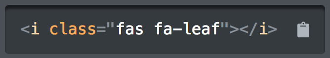
2. Copy ONLY the classes and paste them in the module’s CSS Classes box (next to the class in Step 1).
In the above example: fas fa-leaf
For your info:
fa = font awesome
fas = font awesome solid
far = font awesome regular
fab = font awesome brands
3. Optional: Additional classes for styling
Force the icon to the left or right.
- fa-pull-left
- fa-pull-right
Rotating the icon:
- fa-rotate-90
- fa-rotate-180
- fa-rotate-270
Flip the icon:
- fa-flip-horizontal
- fa-flip-vertical
Spin the icon:
- fa-spin
- fa-pulse
3. Optional: additional css
Use additional CSS to modify the icon color, size, and hover color. View the examples below. Add this CSS to the Main Element Custom CSS box.
Additional CSS for Icon Lists
--icon-color: #eee;
--icon-size: 40px;
Additional CSS for Blurbs
--icon-hover-color: red;
--icon-hover-size: 125px;
--icon-hover-margin: -10px auto 0px auto;
--icon-margin: 0px auto 0px auto;
Additional CSS for Buttons
--icon-size: 40px;
--icon-hover-color: #fff;
Note: these CSS variables will work in all modern browsers but not in Internet Explorer.
Examples
Icons in Lists
To modify the icon color and size, add these CSS properties to the Main Element Custom CSS Box and customize:
--icon-color: #eee;
--icon-size: 50px;
To modify the icon color and size, add these CSS properties to the Main Element Custom CSS Box and customize:
--icon-color: green;
--icon-size: 30px;
Icons in Blurbs
Classes:
fa-blurb fas fa-burn hover-grow
Style the icon color and size where you normally do, under the design tab.
To modify the icon color and size, add these CSS properties to the Main Element Custom CSS Box and customize:
--icon-hover-color: red;
--icon-hover-size: 125px;
--icon-hover-margin: -10px auto 0px auto;
--icon-margin: 0px auto 0px auto;
Icons in buttons
Button Module
- fa-button fas fa-file-download
You can change the icon size and icon hover color by adding this CSS to the module’s Main Element Custom CSS box and customize it.
--icon-size: 40px;
--icon-hover-color: #000;